Dalhousie Themed Plots in R
I created a Beamer template (modification of M-Theme) with Dalhousie themed colours. To further embrace the Dalhousie style guide in my presentation materials, I have used the scale_fill_manual() function in R’s ggplot2 to theme the plots with Dalhousie colours. I still don’t think Python’s ggplot implementation is up to snuff, and matplotlib is, well, not ggplot2… As such, even though I do most of my work in python, I still import all of my data into R and make use of my favourite plotting library, courtesy of Hadley.
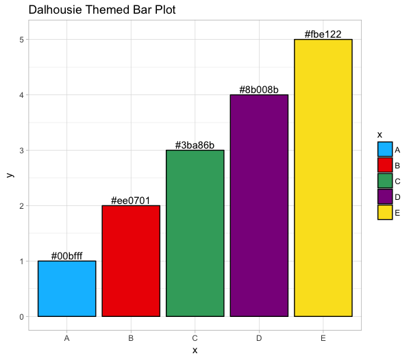
Here is a simple snippet…
dal_colors = c('#00bfff', # Blue
               '#ee0701', # Red
               '#3ba86b', # Green
               '#8b008b', # Purple
               '#fbe122') # Yellow

d = data.frame(x = c('A', 'B', 'C', 'D', 'E'),
               y = c(1, 2, 3, 4, 5),
               colr = dal_colors)

ggplot(d, aes(x=x, y=y, fill=x)) +
    geom_bar(stat='identity', colour='black') +
    geom_text(aes(label=colr), nudge_y=0.1) +
    scale_fill_manual(values = dal_colors) +
    theme_light() +
    ggtitle("Dalhousie Themed Bar Plot")
…and the resulting plot:
Of course, one could simply use the abovementioned colour codes to create a colormap in other visualization libraries. I may do so for matplotlib at some point.
Another useful thing to look up would be the best continuous colour map to use that would fit in with the dalhousie theme. I personally like viridis, and it might work well with the dalhousie theme as is.